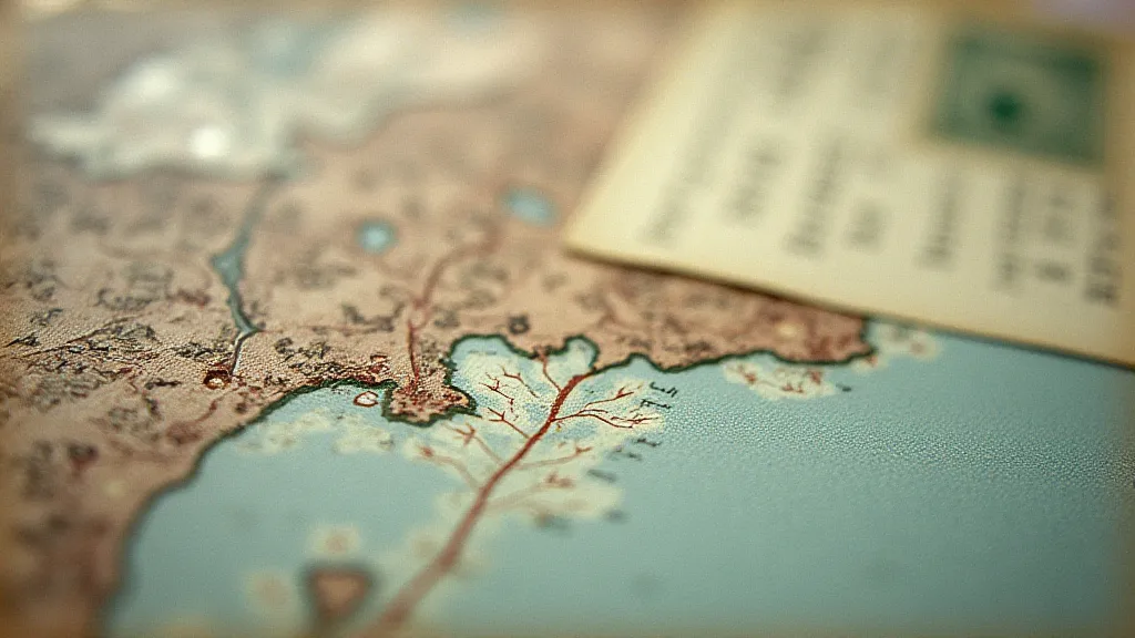
Chromatic Whispers: The Fading Palette of Early Colorized Maine Postcards
Maine. Just the name conjures images of granite coastlines, towering pines, and quaint fishing villages. For generations, these impressions have been shared, cherished, and preserved, in part, through the humble postcard. But imagine receiving a postcard not just depicting these scenes, but imbued with the fragile, ephemeral beauty of hand-applied color. That’s the magic – and the challenge – of early colorized Maine postcards.
My grandfather, a quiet man of methodical habits, instilled in me a deep appreciation for the tangible remnants of the past. He was a collector, not of grand estates or rare jewels, but of these small rectangles of paper. Each one was a window, he’s say, into a world that was slipping away. Many were Maine postcards, of course, a testament to his lifelong connection to the state. Among them, the colorized ones held a particular allure, possessing a wistful quality that resonated with a longing for simpler times.
The Dawn of Color: Hand-Tinting and Its Origins
The late 19th and early 20th centuries saw the rise of the “halftone” printing process – allowing for the mass reproduction of black and white photographs. But the public craved color. It’s worth remembering that color photography was still in its infancy, an expensive and technically demanding endeavor. This demand created a unique opportunity: hand-tinting. These weren't photographs *printed* in color; they were black and white images meticulously painted over by skilled artisans.
The process was complex and labor-intensive. A black and white image would be printed on cardstock, typically linen or similar textured paper. Then, an army of "colorists," often women working in assembly-line style, would apply watercolor, pastels, or occasionally, aniline dyes to the print. Their task was to interpret the photograph’s essence and translate it into vibrant hues. They weren't striving for photographic accuracy; they were aiming for an impression – a feeling. This subjectivity is what gives early colorized postcards their unique character and charm.
The Limitations and the Artistry
The limitations of the process are evident in even the most beautiful examples. Colors weren't always consistent; a building might be rendered in one shade of red on one postcard and another entirely on a subsequent run. Skies often took on an unrealistic, rosy glow – a consequence of the dyes used and the artists’ interpretations of atmospheric effects. Skin tones were often simplified, rendered in standardized hues that disregarded individual variation. These imperfections, however, don't detract from the beauty; they are integral to the postcard's narrative, whispers of the human hand at work.
The artistry lies in the interpretation. Some colorists possessed a remarkable eye for detail, deftly shading leaves, highlighting the gleam of sunlight on water, or capturing the subtle nuances of a coastal sunset. Others adopted a more impressionistic approach, using bold, expressive strokes to evoke a mood or feeling. The best examples manage to strike a delicate balance between technical skill and artistic license, creating images that are both visually appealing and emotionally resonant.
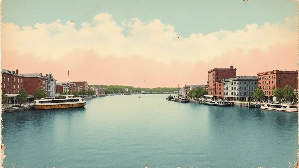
Consider, for example, a postcard depicting a bustling Main Street in Bar Harbor. The black and white photograph alone conveys a sense of place, but the addition of color – the deep green of the trees, the bright red of a passing automobile, the warm yellow of a shop awning – transforms it into a vibrant snapshot of a bygone era. You can almost hear the sounds of the town, smell the salt air, and feel the energy of a thriving community.
The Colors of Maine: Regional Variations and Common Themes
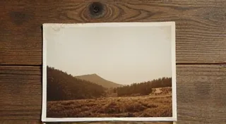
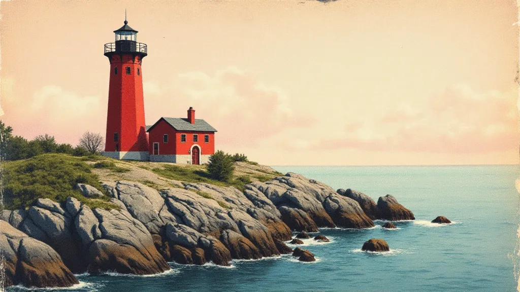
While general trends in colorization existed, certain regional variations and common themes emerge when examining Maine postcards. Coastal scenes – lighthouses, fishing boats, rocky shores – were particularly popular, and colorists often emphasized the drama of the sea, using deep blues and greens to convey the power and majesty of the Atlantic.
Rural landscapes – farms, forests, lakes – were often rendered in a palette of earthy tones, reflecting the agricultural heart of the state. Mountain scenes – the White Mountains and Mount Katahdin – were frequently depicted in shades of green and brown, with a touch of purple to suggest the shadows of the peaks. Towns and cities – Portland, Bangor, Lewiston – were often colorized to highlight their architectural features and commercial vitality. Regardless of the subject matter, the aim was to convey a sense of pride in Maine's natural beauty and cultural heritage.
Preserving the Palette: Restoration and Collecting
Today, these early colorized Maine postcards are treasured by collectors and historians alike. Their fragility and scarcity, however, necessitate careful preservation. Direct sunlight and humidity are the enemy, causing colors to fade and paper to deteriorate. Archival sleeves and acid-free storage boxes are essential for protecting these delicate artifacts.
The debate over restoration is a complex one. While some collectors advocate for preserving the postcard’s original condition, others believe that minor repairs and color enhancements can improve its visual appeal. Any restoration work should be undertaken by a qualified professional, using reversible techniques that do not compromise the postcard's authenticity.
Collecting vintage Maine postcards is more than just acquiring pieces of paper; it’s connecting with a past that is both familiar and distant. It's about appreciating the craftsmanship of the colorists, understanding the social and economic context in which these postcards were created, and preserving a tangible link to Maine's rich history. Each card tells a story – a story of a place, a time, and the people who called it home. They are fleeting glimpses of a world transformed by the human touch, their colors fading, but their charm enduring.